End-to-End / Learning Experience
Zimo Chinese Learning App
Zimo is an App designed to help learners master Chinese characters. As the solo designer and design lead, I drove the entire product design process — from defining the learning experience strategy and core user flow to building the interaction system and visual language. I led all design decisions and collaborated closely with one developer and one project manager to bring the product from concept to launch.
Team
Zimo Chinese
Timeline
Jul 2025 - Mar 2026
Role
Design Lead (Solo Designer)
Collaboration
1 Developer, 1 Project Manager
Background
Learning Chinese is not difficult to start, but difficult to sustain
Chinese is one of the most widely spoken languages in the world — yet for many learners, characters remain the biggest barrier.
Through early research and conversations, we found that:
Learners struggled with long-term retention
Existing apps lacked structured review systems
Motivation dropped when progress felt invisible
The problem wasn’t just about learning characters.
It was about remembering them over time
👉 How might we design a system that helps learners build habits and retain knowledge consistently?
Target Group
Designing for learners who struggle to move forward
Zimo focuses on learners who are not starting from zero.
They already know some pinyin or basic vocabulary, but struggle to connect that knowledge to real-world reading.
Two key user types emerged:
Users like Emily
Need to bridge pinyin and characters to function in daily lifeUsers like David
Need efficient, structured learning that fits into busy routines
Both share common needs:
Turn existing knowledge into recognition
Build consistent learning habits
See clear and motivating progress
This led to a core product direction:
🧠 Design short, repeatable learning loops that support retention and real-life application.

Mood Board & Visual Direction
Creating a calm and supportive learning environment
From the start, a moodboard is helpful to define the look and feel.
The visual direction focused on:
Warm, neutral tones -> reduce intimidation
Soft UI elements -> create approachability
Minimal layouts -> support focus
During early exploration, I considered using food as a metaphor for learning. However, it risked distracting users from the core task, so we shifted toward a clearer and more focused visual direction.
Color palette:
Beige background -> calm learning space
Deep brown -> primary actions
Soft orange -> progress & reward

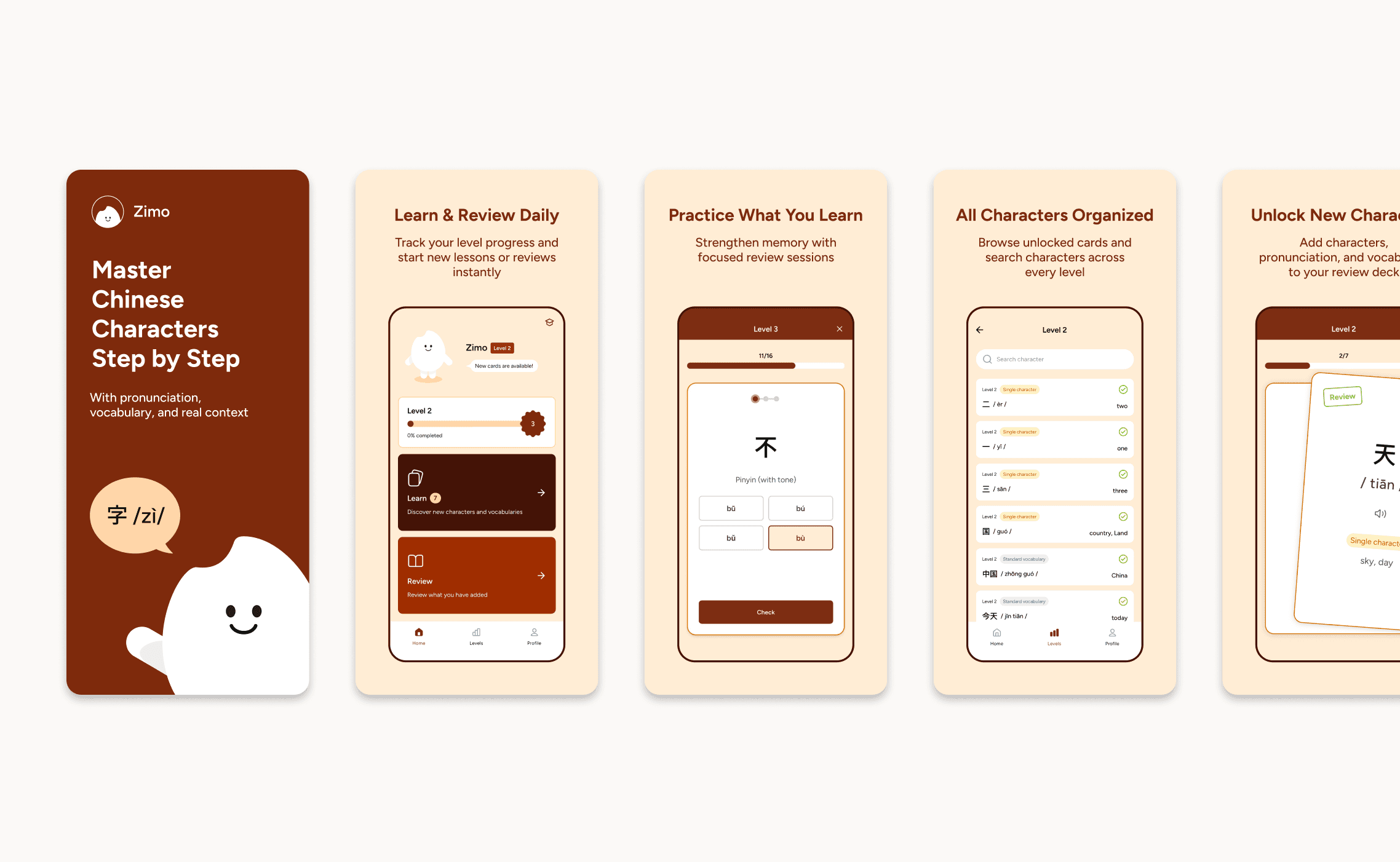
Interaction Design
Turning learning into small, engaging decisions
Retention depends on engagement.
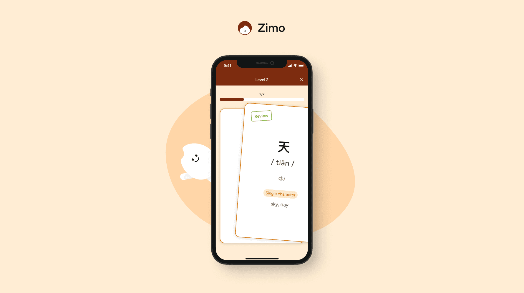
Instead of traditional list-based learning, I introduced a card-based swipe interaction, inspired by familiar patterns.
Users can:
Swipe right -> add to review
Swipe left -> skip
Tap -> enable sound of pronunciation
This turned learning into a series of micro-decisions, reducing friction and increasing agency.
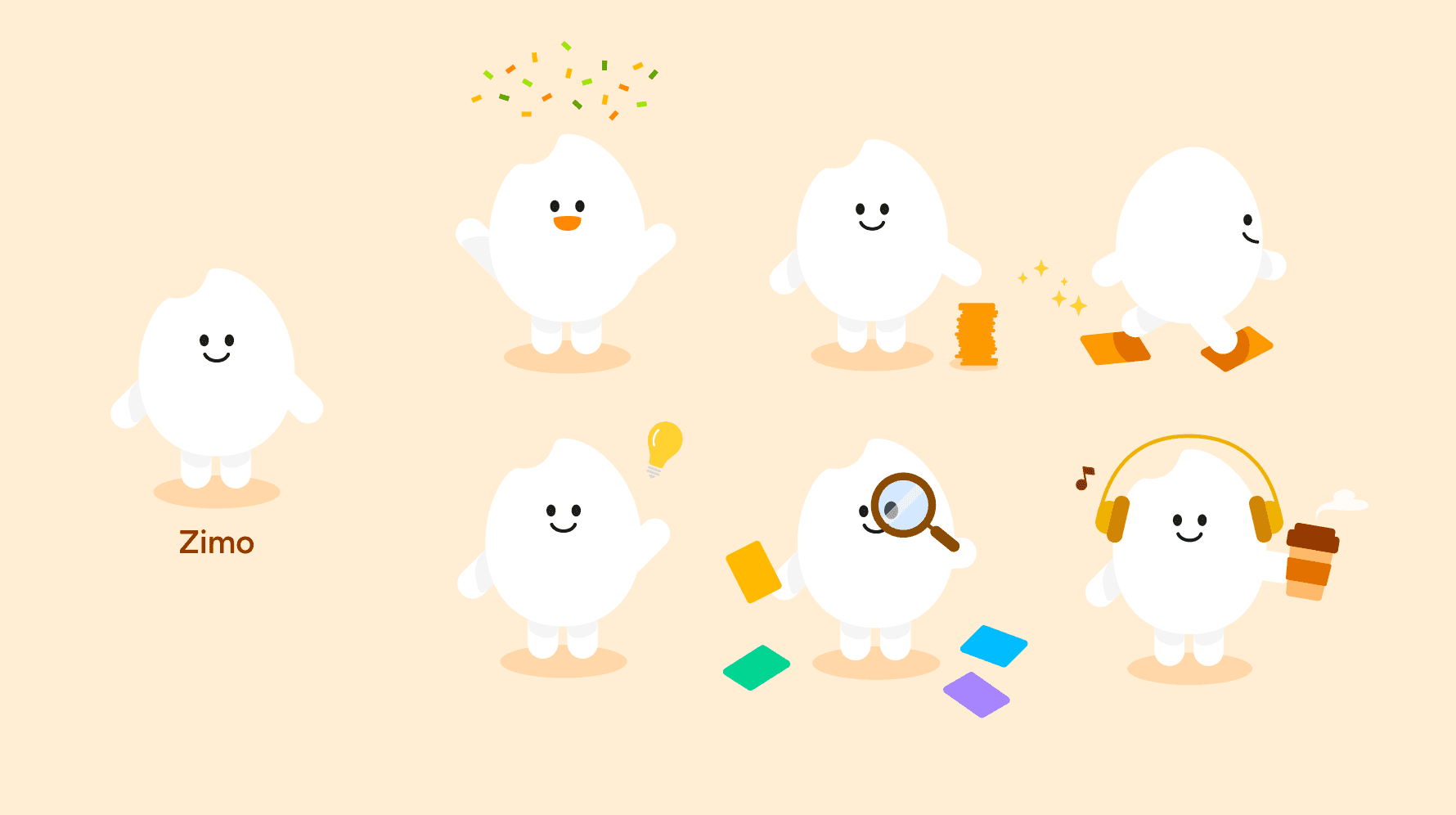
Mascot & Animation Design
Designing a playful learning companion
To make the experience more engaging and less solitary, I created a mascot as a learning companion throughout the app. The character appears in different contexts, bringing a sense of personality and warmth to the experience.
I also incorporated subtle animations to:
Provide feedback during interactions
Reinforce progress and achievements
Create a more dynamic and engaging learning flow
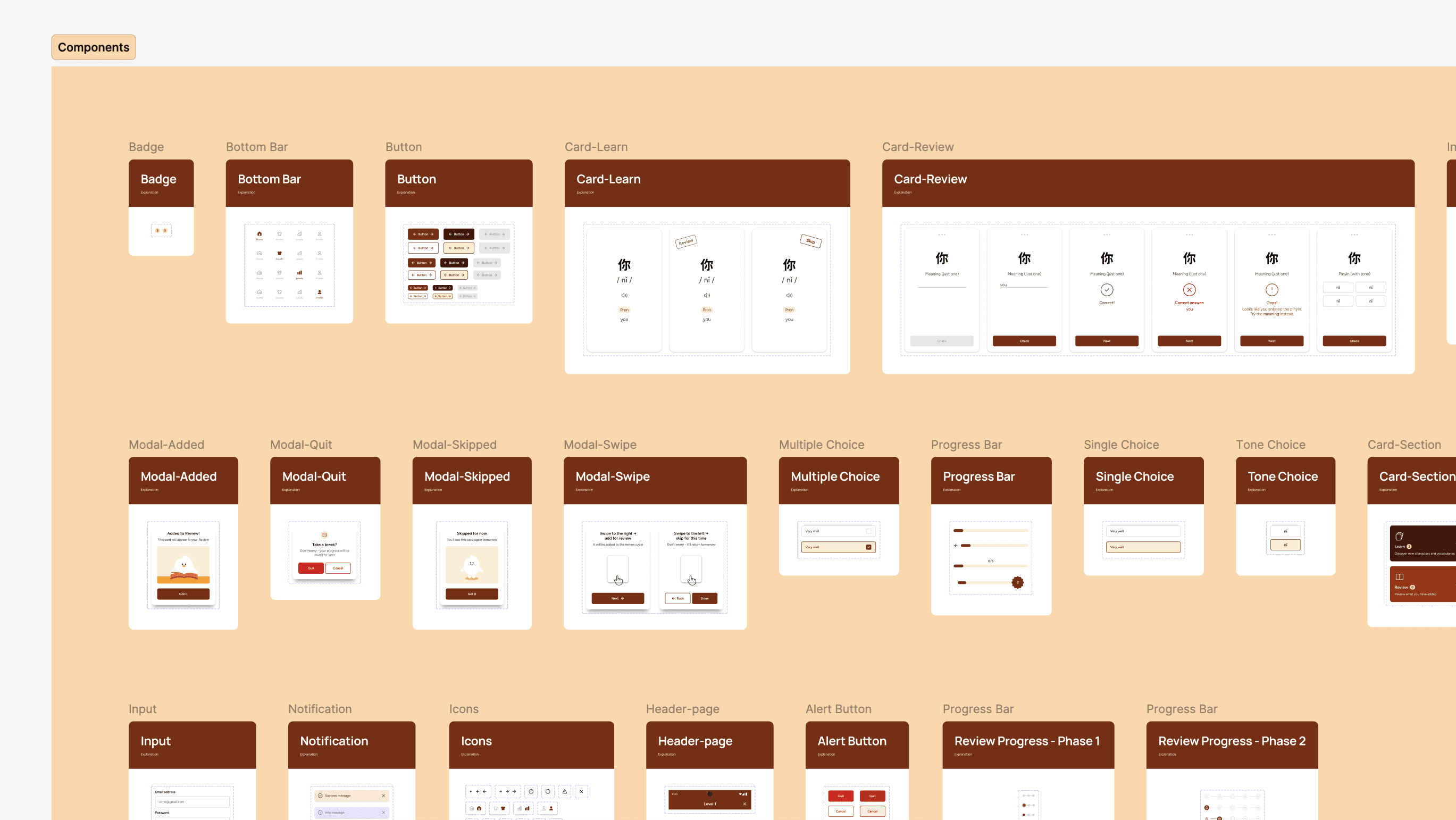
Design System
Building a scalable and developer-friendly design system
To create a more cohesive workflow between design and development, I established a modular design system grounded in the product’s visual identity and interaction patterns. Using Figma variables together with a Tailwind-based structure, I defined reusable components and consistent styling rules that support scalability and flexibility. This approach not only accelerated my design process but also reduced friction during implementation, making it easier for developers to build and maintain the product.

Prototype
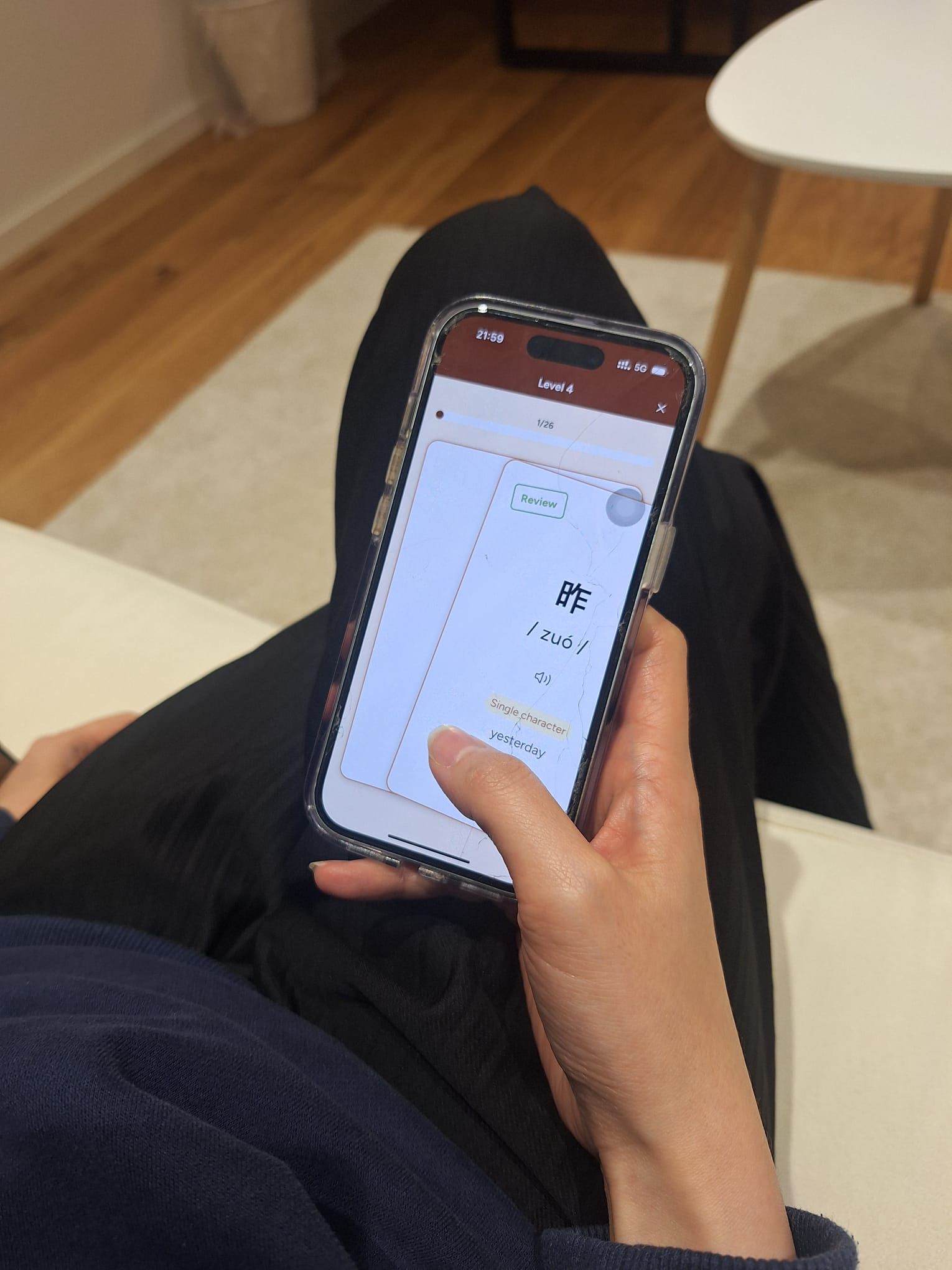
Validating before building to reduce risk and cost
After completing the first version of the prototype, the developer suggested moving directly into development for beta testing. However, I proposed validating the experience first through usability testing using a high-fidelity prototype.


Testing
Early usability testing to uncover hidden issues
We recruited 7 participants and asked them to complete key tasks based on core features. By observing their behavior, we identified usability gaps, unclear interactions, and points of confusion early in the process.
These insights allowed us to refine the experience before development, reducing rework and ensuring a more efficient and confident build for the beta version.

Feedback & Iteration
Clarity and guidance were the focus
Based on testing, I refined:
Onboarding -> clearer explanation of the system
Progress -> more visible and rewarding
Microcopy -> more intuitive swipe guidance
Visual hierarchy -> stronger focus on key actions
Beta Test & Results
Motivation and habit-building drive long-term learning
During beta testing, we focused on:
Learning loop effectiveness
Daily usage patterns
User motivation and retention
Results showed:
Users developed a clearer understanding of when and how to review
The swipe interaction encouraged small, repeatable learning actions
Visible progress and rewards increased motivation to continue learning
📈 Consistent, low-friction interactions help turn learning into a habit
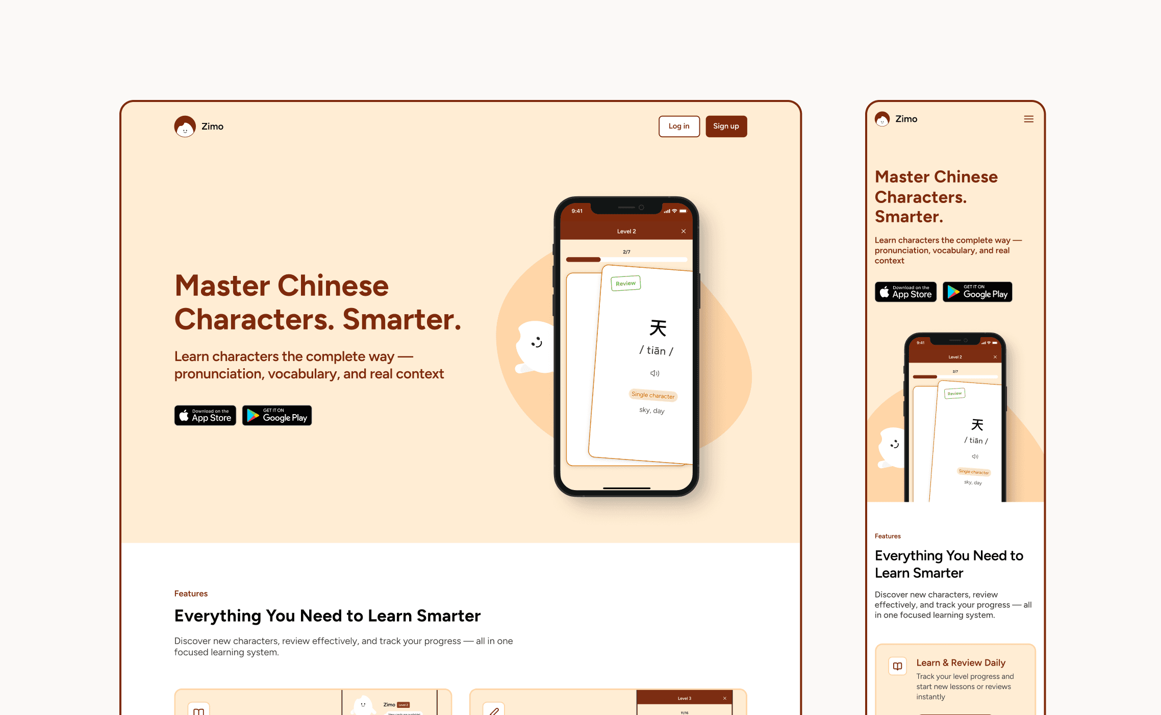
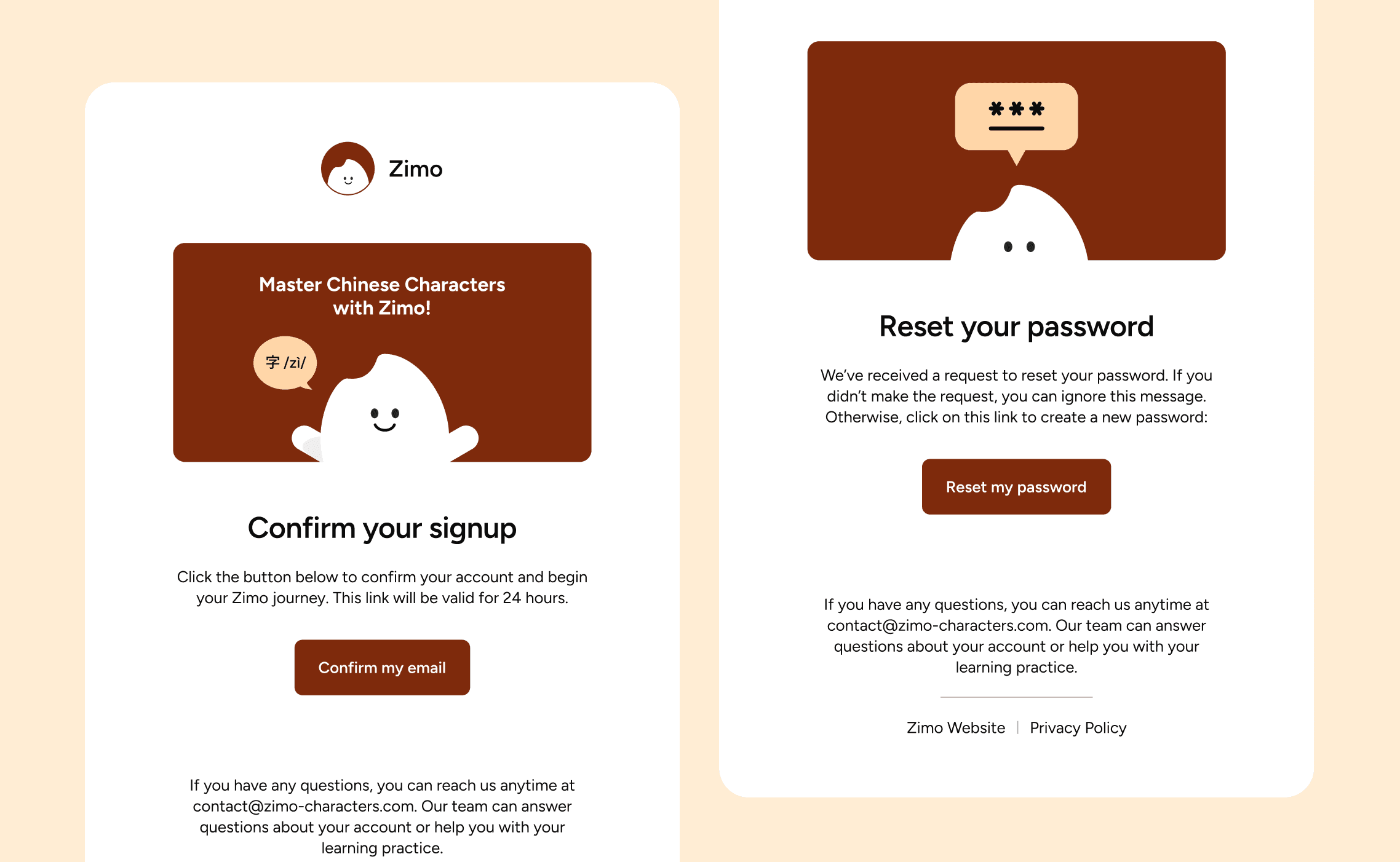
Launch & Website
Designing beyond the product to create a cohesive experience
As the sole designer, I extended the experience beyond the app:
Marketing website
App Store assets
Email verification flow
This ensured a consistent experience across all touchpoints.
Reflection
From concept to launch, leading design through execution
Designing Zimo from 0 -> 1 gave me hands-on experience in bringing a product from initial concept to launch. As the design lead, I worked closely with the developer and project manager using an agile workflow to ensure continuous alignment and steady progress.
Throughout the process, I learned how to balance vision with practical constraints, prioritize effectively, and make decisions that kept the project moving forward. This experience strengthened my ability to lead cross-functional collaboration and deliver a product within timeline.


